
How Vulnerable are Northam-won GOP Districts?

In my Q2 fundraising round-up , I provided context for each district by showing the percentage that Ed Gillespie, the GOP nominee for Governor in 2017, received in each. Another Virginia blog, Blue Virginia, did their own round-up (sans analysis) and also used the 2017 Governor’s race as a benchmark for each district. Meanwhile, Ben Tribbett (@notlarrysabato) recently came out with his initial House of Delegates race ratings, which contrasted against those of Democratic analyst Chaz Nuttycombe (@chaznuttycombe).
In the Blue Virginia post discussing those ratings, like the fundraising round-ups, they used the 2017 Governor’s race as a benchmark for each district. But how much does that really tell us about how those district will perform in 2019?
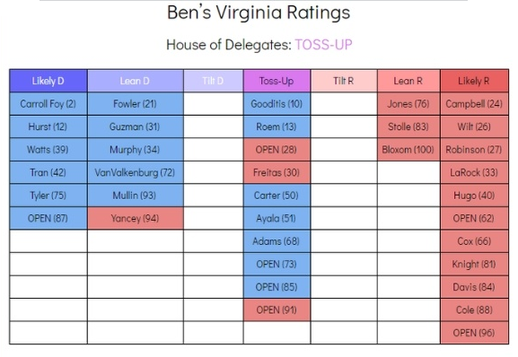
For reference’s sake, here are Ben’s ratings:
And here are Chaz’s ratings, far more bullish on Democrat’s chances:
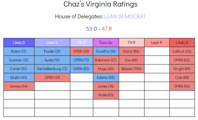
Why are these so different? Why does Ben only see one GOP district as “Lean D” and the rest are toss-ups or better? Why does Ben see seven Dem-held districts as toss-ups, including two that Chaz thinks are “Likely D”?
For the purposes of the analysis below, I focus on 23 competitive races. From the ratings above, I exclude everything in Ben’s “Likely D” column and HD-62 and HD-88 from Chaz’s “Likely R” column. I also exclude Nick Freitas’s HD-30, which doesn’t fit the mold of a “competitive” district for analysis purposes.
I see three reasons why the 2017 Governor’s race may be a faulty indicator. The first two are:
1) The presence of a Libertarian candidate
Most Delegate races in November will be between two candidates, not three. Having a third-party in the Governor’s race makes it an apples-to-oranges comparison. Specifically, Gillespie’s total was likely deflated by the presence of the Libertarian.
2) The nationalization of the race
It was inevitable that the first general elections since Donald Trump’s election would become part of the national news cycle. In addition, both parties played into this, motivating voters to consider the candidates for reasons beyond state issues. We saw a significant undervote from Governor to everything else. Also, some may have voted against Gillespie as a “protest vote” against Trump, even as they voted for other Republicans down the ballot (or left those races blank).
Using 2017 AG as a Benchmark Instead
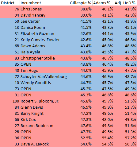
For those two reasons, perhaps we should consider a different 2017 statewide race as our district benchmarks. Below is a chart of the 23 most competitive seats by Ed Gillespie vote percentage and John Adams vote percentage:
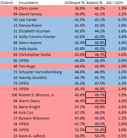
In every district, Adams outperformed Gillespie. That is, voters in these districts cast a vote for a statewide Republican, unadulterated by a third-party, and where neither candidate had a robust name ID or was the subject of national attention.
It’s not a huge difference in every district. It makes Lee Carter’s HD-50 go from 41.5% to 42.1%; in either case, you could shorthand it to a “42% GOP district.” Other districts are more notable. The black boxes show districts where Adams outperformed Gillespie by three points or more.
I previously made note about Rob Bloxom hardly raising any money in Q2, but by using the AG numbers, his HD-100 jumps from 45.8 percent to 49.7 percent. Dawn Adams, for all her problems, looks a lot more secure in a district where Republicans only got 43.4 percent; in a 46.8-percent GOP District, her seat is even more vulnerable.
The average out-performance in these 23 districts was 2.0 percent. This isn’t necessarily a lot, but so many races in 2017 were decided by two points or fewer, so potentially significant.
Using 2017 HoD as a Benchmark Instead
If we’re benchmarking the House of Delegate races, why do we even need a stand-in? Why not directly compare to how these districts fared in 2017?
For many districts, there’s a simple reason why we can’t: redistricting. Ten of the 23 races on this list have changed, slightly or significantly, since 2017. In other races, there isn’t even data at the House of Delegates level; for example, Chris Jones’s old HD-76 was uncontested in 2017.
But there’s another reason, too: candidates and campaigns matter. The Blue Wave in 2017 caught most people by surprise. Districts that were thought to be competitive in 2017 won’t be this year; districts not thought to be competitive in 2017 will be this year (and not just because of redistricting). To keep things simple, I’ll rely on averages to smooth out those district-by-district and candidate-by-candidate differences.
We do have 13 districts that provide an apples-to-apples comparison. The contours of these races are all different, and will be different again in 2019. But in all these cases, the Republican House of Delegates candidate outperformed the Attorney General nominee (and certainly outperformed Gillespie). By how much?
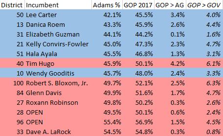
In some districts (HD-31, HD-27) hardly at all. In others, (HD-40, HD-50) by 3+ points. On average, these 13 competitive Republican House of Delegates campaigns outperformed John Adams by 1.8 percent (and outperformed Ed Gillespie by 3.7 percent).
(It’s here that I must note that simply averaging 13 districts isn’t the most precise analytical approach; this is quick-and-dirty Excel work.)
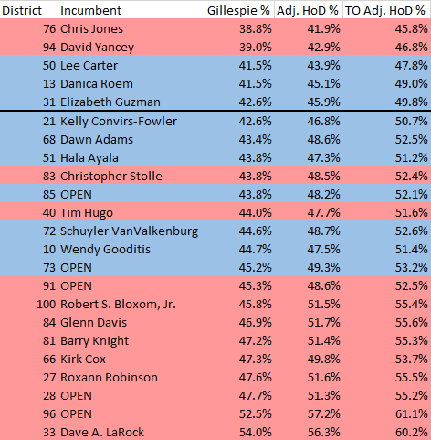
For the purposes of creating a benchmark, let’s go ahead and apply that 1.8 percent average across all 23 races:
These tell a much different story than before. Now, Dawn Adams is defending a 48.6 percent GOP district and Debra Rodman’s open HD-73 is a 49.3 percent district. Four races thought to be competitive (HD 100, 84, 27, and 28) now have a lean-GOP benchmark.
You may say to yourself: well, hold on. Dawn Adams’ HD-68 may be 48.6 percent Republican, but that’s still a majority Democratic district, right?
Now, we start talking about the 3rd reason why 2017 may be a faulty indicator: Turnout.
2017 Turnout vs 2019 Turnout
Turnout is the $64,000 question for 2019. We know that turnout for an off-off cycle will be lower. What we don’t know is how low, and more importantly, who will that help?
It’s accepted as a truism that lower turnout benefits Republicans, but that’s not necessarily always the case. Instead, lower turnout represents an opportunity for Republicans – but it still requires effort to turn that opportunity into an advantage.
Since we’re talking about the House of Delegates races here, we can look back at previous cycles with these districts (redistricting aside): 2011, 2013, 2015, and 2017. More specifically, we are looking at the differences between Governor years (2013, 2017) and off-off-cycle years (2011, 2015).
I’ve crunched a lot of numbers on turnout, and I may share those in a future article, but for the purposes of this benchmarking exercise, we’ll stick with GOP vote percentage. This requires comparing only districts that were competitive in back-to-back cycles. The question is: How much better can we expect Republicans to perform in 2019 compared to 2017 due to lower turnout?
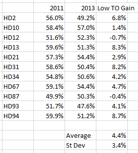
First, let’s look at how GOP candidates fared in competitive (in both cycles) districts from 2011 to 2013:
Next, we’ll look at the GOP Vote Percentage in competitive districts from 2013 to 2015:
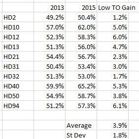
What do we see from 2011 (statewide turnout: 28.6 percentage) to 2013 (turnout: 43 percentage) to 2015 (turnout: 29.1 percentage)? We see a modest decline in GOP vote share, followed by a roughly equal increase. The large variation from 2011 to 2013 and small sample size adds to the imprecision, but generally speaking: GOP districts that were close in Governor cycles are less close in off-off cycles.
Now, let’s move ahead with a big jump in turnout and a Blue Wave, the GOP vote percent difference from 2015 to 2017:

As a note, the last column year is the loss of GOP vote percent, so it represents the decline in each district. Based off previous cycles, you can see how easy it was for GOP incumbents to be wholly unprepared for these shifts.
If we just followed the ’11/’13/’15 pattern, then we could just add 11 percent to the adjusted HoD numbers above. Doing this, every race on this easily clears 50 percent and Republicans will hold all their seats and pick up 10 more. Based on the decline of GOP vote share in Virginia the past three years, that seems unlikely.
Let’s just assume that the GOP enjoys the same rise they did from 2013 to 2015, which is 3.9 percent on average. What does adding 3.9 percent to each district do to our benchmark?
The Gillespie percentage column is the district benchmark commonly used in analysis, as noted above. Next to that is the 2017 GOP House Candidate benchmark I calculated. The final column adds 3.9 percent for 2019 turnout effects. Under this scenario, Republicans pick up 6-8 seats, and lose only the Jones and Yancey seats.
This is certainly an optimistic GOP map. Let’s go a bit more conservative and halve that increase, and arbitrarily give a 2 percent increase due to turnout:

The boxed numbers here represent flipped districts; in this scenario, Democrats flip three seats and Republicans flip four.
In other words, if lower turnout in 2019 provides even just half the advantage it provided Republicans from 2013 to 2015, then Republicans increase their advantage in the House.
CAVEAT: There are a dozen different ways you can crunch these numbers, and a dozen different reasons why this analysis is surface-level. As I said above, these numbers are based on statewide averages and inherently imprecise. They don’t take into account geographic differences (for example, Northern Virginia has seen its GOP vote share drop more than the rest of the state) or locale differences (i.e., suburbs vs exurbs). They certainly don’t take into account open seats versus incumbents, or the quality of candidates, or the quality of campaigns (including fundraising). That’s why these charts aren’t race rankings, just number crunching.
For example, based on incumbency, fundraising disparity, and political experience, I can see why Ben has Chris Jones (in a 44 percent adjusted GOP district) as vulnerable as Rob Bloxom (in a 53 percent adjusted GOP district). It’s why I would rate HD-28 as far more vulnerable for Republicans than HD-40 (an opinion also shared by Ben). A district benchmark is the starting point for a campaign, not the ending point.
The bottom line is that retaining the House of Delegates is the best bulwark for Republicans against a Democrat trifecta, and despite Democratic momentum in recent elections, there’s a lot of fight to be had over the next 3 months.
Ben and Chaz ratings image credit to @chaznuttycombe. Images of Excel charts are original.
